This tutorial is the second entry in the Scrapbook series in which we will be building a full featured scrapbooking application. In the previous installment we set up a basic foundation for our application and got our feet wet with Cappuccino graphics. This tutorial will cover adding drag and drop to our application, and touch on a number of important Cappuccino topics in the process. If you haven’t done so already, you should download the source from Part I, since that is what we will be starting off with. You can alternatively choose to view the completed source for this tutorial as well and simple follow along with the code.
Before we can implement drag and drop, we of course first need somewhere to drag from. To get started as quickly as possible, let’s make a simple window with a static collection of images for our user to choose from:
In the future, you could imagine connecting this to a back-end, allowing for user storage and internet searching, but that is outside of the scope of our current task, and will remain for a future lesson. Just as before, we will be generating a new class in a new file to manage this collection of images, the “PhotoPanel” class:
@import <AppKit/CPPanel.j>

@implementation PhotoPanel : CPPanel
{
}
@end
Unlike our last segment though, we won’t be managing this panel with a
window controller since it is for the most part stateless and doesn’t
require any special management (yet). Instead, we’ll be putting all our
logic directly into the panel subclass. Let’s set up our standard
requirements by creating a custom init method. This should look pretty
familiar since it is very similar to how we set up our PhotoInspector in
the last lesson, with the only difference being that it is not taking
place in a CPWindowController:
- (id)init
{
    self = [self initWithContentRect:CGRectMake(0.0, 0.0, 300.0, 400.0)
                           styleMask:CPHUDBackgroundWindowMask |
                                     CPClosableWindowMask |
                                     CPResizableWindowMask];

    if (self)
    {
        [self setTitle:"Photos"];
        [self setFloatingPanel:YES];
    }

    return self;
}
Now that that is out of the way, we can get to the meat of our problem:
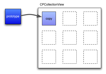
creating an area to display our draggable images. For this task we will
be using a CPCollectionView. Collection Views display grids of arbitrary
content, and are particularly good at creating fluid layouts. For a
collection view to be able to appropriately display your data, it
requires that you specify a “prototype” item and view that it can base
all of its actual items on. You create one view for the collection view,
and it then uses this view as a model for all the subviews that it
automatically generates.
This, combined with the collection view’s resize options, allows for a very flexible and customizable system. Often times you can simply use one of the many built in view classes for this task, styling and modifying them as you see fit, but let’s instead create our own custom view so you can start getting used to this for when you’ll need it for more complex tasks. Let’s create a new “PhotoView” class right below the definition of our PhotoPanel class:
@implementation PhotoView : CPView
{
    CPImageView _imageView;
}

- (void)setRepresentedObject:(id)anObject
{
    if (!_imageView)
    {
        var frame = CGRectInset([self bounds], 5.0, 5.0);

        _imageView = [[CPImageView alloc] initWithFrame:frame];

        [_imageView setImageScaling:CPScaleProportionally];
        [_imageView setAutoresizingMask:CPViewWidthSizable | CPViewHeightSizable];

        [self addSubview:_imageView];
    }

    [_imageView setImage:anObject];
}

- (void)setSelected:(BOOL)isSelected
{
    [self setBackgroundColor:isSelected ? [CPColor grayColor] : nil];
}

@end
This is a very simple view class that is meant to display an image and a
selected state. We’ve implemented two very important methods that the
collection view will use to communicate with this class:
setRepresentedObject: and setSelected:. As we mentioned earlier, a
collection view manages arrays of arbitrary data, and it is up to you to
decide how to display it. In our case, this is very simple because our
data is simply a list of images. When the collection view assigns us a
specific “represented object”, we know that it is just an image, and can
display it in an inner image view. The collection view will also notify
us when we become “selected” through some user action (such as
clicking). Here again, our job is very simple: we simply change our
background color to display this selection. Now that we have a
satisfactory view class to show our images in, we can go back to our
PhotoPanel’s init method and create a collection view:
- (id)init
{
    self = [self initWithContentRect:CGRectMake(0.0, 0.0, 300.0, 400.0)
                           styleMask:CPHUDBackgroundWindowMask |
                                     CPClosableWindowMask |
                                     CPResizableWindowMask];

    if (self)
    {
        [self setTitle:"Photos"];
        [self setFloatingPanel:YES];

        var contentView = [self contentView],
            bounds = [contentView bounds];

        bounds.size.height -= 20.0;

        var photosView = [[CPCollectionView alloc] initWithFrame:bounds];

        [photosView setAutoresizingMask:CPViewWidthSizable];
        [photosView setMinItemSize:CGSizeMake(100, 100)];
        [photosView setMaxItemSize:CGSizeMake(100, 100)];

        var itemPrototype = [[CPCollectionViewItem alloc] init],
            photoView = [[PhotoView alloc] initWithFrame:CGRectMakeZero()];

        [itemPrototype setView:photoView];

        [photosView setItemPrototype:itemPrototype];

        var scrollView = [[CPScrollView alloc] initWithFrame:bounds];

        [scrollView setDocumentView:photosView];
        [scrollView setAutoresizingMask:CPViewWidthSizable | CPViewHeightSizable];
        [scrollView setAutohidesScrollers:YES];

        [[scrollView contentView] setBackgroundColor:[CPColor whiteColor]];

        [contentView addSubview:scrollView];

        images = [  [[CPImage alloc]
                        initWithContentsOfFile:"Resources/sample.jpg"
                                          size:CGSizeMake(500.0, 430.0)],
                    [[CPImage alloc]
                        initWithContentsOfFile:"Resources/sample2.jpg"
                                          size:CGSizeMake(500.0, 389.0)],
                    [[CPImage alloc]
                        initWithContentsOfFile:"Resources/sample3.jpg"
                                          size:CGSizeMake(413.0, 400.0)],
                    [[CPImage alloc]
                        initWithContentsOfFile:"Resources/sample4.jpg"
                                          size:CGSizeMake(500.0, 375.0)],
                    [[CPImage alloc]
                        initWithContentsOfFile:"Resources/sample5.jpg"
                                          size:CGSizeMake(500.0, 375.0)],
                    [[CPImage alloc]
                        initWithContentsOfFile:"Resources/sample6.jpg"
                                          size:CGSizeMake(500.0, 375.0)]];

        [photosView setContent:images];
    }

    return self;
}
This may seem a bit overwhelming, but if we analyze it in pieces you’ll see that it’s really quite straight forward. Let’s start with the first part:
var contentView = [self contentView],
    bounds = [contentView bounds];

bounds.size.height -= 20.0;

var photosView = [[CPCollectionView alloc] initWithFrame:bounds];

[photosView setAutoresizingMask:CPViewWidthSizable];
[photosView setMinItemSize:CGSizeMake(100, 100)];
[photosView setMaxItemSize:CGSizeMake(100, 100)];
This is just very rudimentary layout code. We are grabbing our panel’s
content view (the root view of the panel), querying it for it’s size,
and making a collection view that is roughly that size (a bit smaller by
20 pixels). We then set the autoresizing mask to be CPViewWidthSizable.
We’ll touch on why we chose this particular resizing mask in a second.
The next two lines are the most important, since they define the way the
collection view will reflow it’s items when it is resized. As you can
see we’ve chosen a minimum size equal to the maximum size for our items.
This means that no matter what, we want our PhotoViews to be 100 x 100.
You can play around with these two values and see that you can
optionally choose to allow them to resize, causing the images to becomes
larger as the collection view becomes larger, and smaller as it shrinks.
Following this, we create the item prototype we spoke about earlier:
var itemPrototype = [[CPCollectionViewItem alloc] init],
    photoView = [[PhotoView alloc] initWithFrame:CGRectMakeZero()];

[itemPrototype setView:photoView];

[photosView setItemPrototype:itemPrototype];
This is pretty straight forward because our PhotoView class does most of
the work. We simply create a new CPCollectionViewItem, set its view to
be a PhotoView, and set this as the item prototype. Notice we didn’t
bother giving our PhotoView a meaningful size, since this is handled by
the min and max item sizes we defined earlier. The following section is
probably also new to you:
var scrollView = [[CPScrollView alloc] initWithFrame:bounds];

[scrollView setDocumentView:photosView];
[scrollView setAutoresizingMask:CPViewWidthSizable | CPViewHeightSizable];
[scrollView setAutohidesScrollers:YES];

[[scrollView contentView] setBackgroundColor:[CPColor whiteColor]];

[contentView addSubview:scrollView];
Here we are creating a scroll view for our collection view. This is because we may have more content than is currently visible in our panel, so we want it to be accessible through scrolling. Scroll views in Cappuccino are quite flexible and allow for a great deal of customizability, both out of the box and also through the creation of new subclasses. The basic structure of a scroll view is as follows:
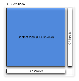
As you can see, the scroll view itself is simply a container for the
CPScroller and CPClipView classes that do most the work. The scrollers
simply give the user an interface to scroll with, and can be hidden or
completely replaced with your own custom subclasses. The content view is
an instance of the CPClipView class and is responsible for actually
clipping the view of interest (called the document view). Together this
collection of views provide a very powerful and customizable interface
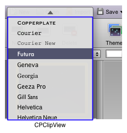
for programmers. For example, although they look nothing like it, menus
in Cappuccino actually use these components to manage their scrolling:
Returning to the code at hand, we are creating a scroll view of the same size as our original collection view. We then set it’s document view to be this collection view, since it is what we want to be scrolled. We then set it’s autoresizing mask to be both sizable horizontally and vertically. This is so that the scroll view grows along with it’s parent panel in both directions. We can no return to the question of why we chose to just make our collection view sizable horizontally. Since collection views manage their own layout, they may grow and shrink vertically depending on their content. For this reason, we don’t want the height of our collection view based on it’s parent view, but instead on its content. However, the width of the collection view is completely left for us to decide, and so we make sure that it completely fits its parent scroll view. In the next line, we turn on autohiding of our scrollers, which is usually a better visual experience for the user. Finally, we set the background color of the scroller’s content view to white, and add the scoll view to the panel’s content view. After this, we finally create our static array of images and set it as the content of our collection view:
images = [  [[CPImage alloc]
                initWithContentsOfFile:"Resources/sample.jpg"
                                  size:CGSizeMake(500.0, 430.0)],
            [[CPImage alloc]
                initWithContentsOfFile:"Resources/sample2.jpg"
                                  size:CGSizeMake(500.0, 389.0)],
            [[CPImage alloc]
                initWithContentsOfFile:"Resources/sample3.jpg"
                                  size:CGSizeMake(413.0, 400.0)],
            [[CPImage alloc]
                initWithContentsOfFile:"Resources/sample4.jpg"
                                  size:CGSizeMake(500.0, 375.0)],
            [[CPImage alloc]
                initWithContentsOfFile:"Resources/sample5.jpg"
                                  size:CGSizeMake(500.0, 375.0)],
            [[CPImage alloc]
                initWithContentsOfFile:"Resources/sample6.jpg"
                                  size:CGSizeMake(500.0, 375.0)]];

[photosView setContent:images];
We are now almost set to see this run, all that remains is a bit of housekeeping in the PhotoPanel class declaration:
@implementation PhotoPanel : CPPanel
{
    CPArray images;
}
@end
As well as editing our AppController.j to display this panel:
@import <Foundation/CPObject.j>

@import "PageView.j"
@import "PhotoInspector.j"
@import "PhotoPanel.j"


@implementation AppController : CPObject
{
}

- (void)applicationDidFinishLaunching:(CPNotification)aNotification
{
    // ...

    [[[PhotoPanel alloc] init] orderFront:nil];
}

@end
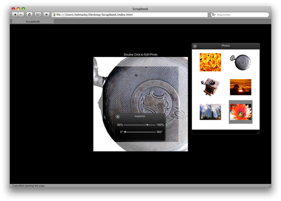
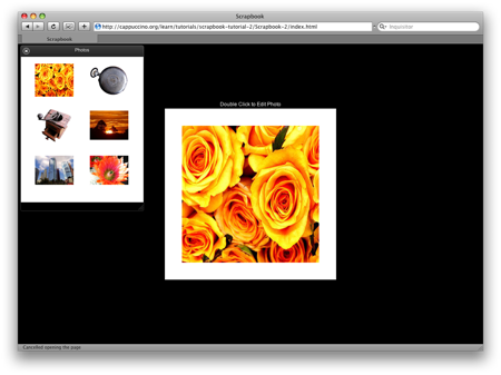
If you now run this code, it should look something like this:
Now that we have a satisfactory place to drag our images from, setting
up the code to actually enable dragging is surprisingly simple. Our
PhotoPanel that we just created is our drag source, meaning this is
where drag and drop is initiated. Luckily for us, CPCollectionView
actually has a lot of drag and drop functionality built right in, so the
first step is simply to make our PhotoPanel class the delegate of the
collection view it creates:
[photosView setAutoresizingMask:CPViewWidthSizable];
[photosView setMinItemSize:CGSizeMake(100, 100)];
[photosView setMaxItemSize:CGSizeMake(100, 100)];
[photosView setDelegate:self];
As the collection view delegate, the PhotoPanel only needs to implement
two methods in order to turn on drag support:
collectionView:dragTypesForItemsAtIndexes: and
collectionView:dataForItemsAtIndexes:forType:. To understand the first
method, we’ll have to get a firmer grasp of the drag and drop server in
Cappuccino first. In Cappuccino, any view can make items available for
dragging (drag sources), as well as accept drops of items (drag
destinations). The only way to coordinate different views making
different kinds of data available for drag and drop is to have a system
of “drag types”. In this way, views can announce what kind of items they
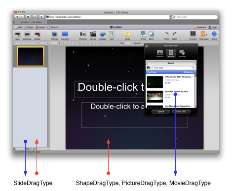
allow to be dragged from them, and to them. For example, in 280
Slides, there were a number of different drag types. The slide navigator
on the left both provided and accepted the SlideDragType. The Media
window on the other hand, only provided the shape, picture, and movie
drag type. The editing area in the center however simply accepted the
shape, picture, and movie drag type.
The collectionView:dragTypesForItemsAtIndexes: delegate method simply
asks the delegate what kinds of drag types are represented by the
elements in the desired indexes. We could choose to use one of the many
built in drag types, but let’s go ahead and create our own for now at
the top of the file:
@import <AppKit/CPPanel.j>

PhotoDragType = "PhotoDragType";

@implementation PhotoPanel : CPPanel@implementation PhotoPanel : CPPanel
Creating a new drag type is as easy as making a new global string. The reason we’ve made it global, is that there may be other classes and files that care about this string. In fact, there should be if we ever hope to drop these photos anywhere! Now, we can simply return this drag type in our delegate method:
- (CPArray)collectionView:(CPCollectionView)aCollectionView
 dragTypesForItemsAtIndexes:(CPIndexSet)indices
{
    return [PhotoDragType];
}
Notice we didn’t actually bother checking the index set, and we instead always return a single item array. This is not a particularly forward thinking way of implementing this, but since we haven’t turned on multiple selection, and we only have one type of item in our collection view, we can get away with doing this without worry. Now we have to actually return the data that will be sent to our drag destination once the drag session is successfully completed:
- (CPData)collectionView:(CPCollectionView)aCollectionView
   dataForItemsAtIndexes:(CPIndexSet)indices
                 forType:(CPString)aType
{
    var firstIndex = [indices firstIndex];

    return [CPKeyedArchiver archivedDataWithRootObject:images[firstIndex]];
}
What we are doing here is returning a data object representing the image
in question. Again, since only one image can ever be selected at any
given time, we simply grab the first index from the index set. If we
ever want to support multiple selection and drag and drop, we would have
to make this a bit more complex. However, since the user would only drag
one image to one pane in our scrapbooking application, we don’t really
need to worry about these scenarios. The one thing you may find curious
about this is that we return a data object instead of the image itself.
CPData is the lingua franca for Cappuccino. It provides a common way to
interchange information between different services (such as drag and
drop), store information (to a database or to a file), or even to
communicate between applications. You can think of CPData roughly as a
serialized format like JSON, but they are really quite different. For
more detail on when you would want to use JSON and when you would want
to use CPData, feel free to read the Data and Archiving Guide that we
will be posting shortly. By returning a CPData object here, we are
ensuring that the image can be duplicated and shared by any number of
services, and all we had to do was call on CPKeyedArchiver‘s class
archivedDataWithRootObject: method. This process is called archiving, or
keyed archiving.
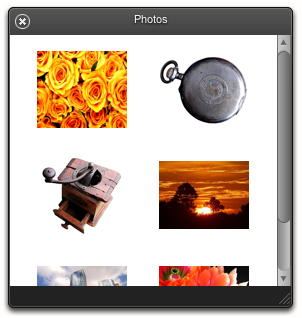
If you go ahead and refresh your application, you’ll see that you can now drag images out of the PhotoPanel, but you can’t drop it anywhere yet…
The only thing left to do now is allow for a drag session to be
completed by making our PageView a drag destination. If you recall from
earlier in this lesson, we created a custom drag type, PhotoDragType, so
that we could publicize the kind of data we were making available. We
will now use this same drag type to allow PageView to announce that it
can accept drags of this type. In PageView.j, simply import PhotoPanel
and add the following line to the initWithFrame: method:
@import "PhotoPanel.j"

// ...

        [_borderLayer setDelegate:self];

        [_rootLayer addSublayer:_borderLayer];

        [_rootLayer setNeedsDisplay];

        [self registerForDraggedTypes:[PhotoDragType]];
    }

    return self;
}
As you can see, we can register for any number of drag types, but are
sticking to the one we created here. Now there’s only one thing really
left to do, which is implement performDragOperation: on PageView:
- (void)performDragOperation:(CPDraggingInfo)aSender
{
    var data = [[aSender draggingPasteboard] dataForType:PhotoDragType];

    [_paneLayer setImage:[CPKeyedUnarchiver unarchiveObjectWithData:data]];
}
This method gets called at the end of a successful drag session. It is
passed a CPDraggingInfo object that contains information about the drag
in question, including the draggingPasteboard which contains the data we
originally set in our PhotoPanel class. All we need to do is unarchive
it to get a new copy of the image, and then set that image on our panel
layer. If you refresh your application, drag and drop should work
completely now!
However, we can still add a few UI cues to our user to make the experience much better. Specifically, lets make our page view “light up” when it is about to accept a drag, so that our user knows he can let go. To do this, let’s first create a new method to show “active state”:
- (void)setActive:(BOOL)isActive
{
    _isActive = isActive;

    [_borderLayer setNeedsDisplay];
}
We’ve created a new member variable, so make sure to add it to our PageView declaration:
@implementation PageView : CPView
{
    CALayer     _borderLayer;
    CALayer     _rootLayer;

    PaneLayer   _paneLayer;
    BOOL        _isActive;
}
Let’s also modify our drawing method to take _isActive into account:
- (void)drawLayer:(CALayer)aLayer inContext:(CGContext)aContext
{
    if (_isActive)
        CGContextSetFillColor(aContext, [CPColor blueColor]);
    else
        CGContextSetFillColor(aContext, [CPColor whiteColor]);

    var bounds = [aLayer bounds],
        width = CGRectGetWidth(bounds),
        height = CGRectGetHeight(bounds);

    CGContextFillRect(aContext, CGRectMake(0.0, 0.0, width, 40.0));
    CGContextFillRect(aContext, CGRectMake(0.0, 40.0, 40.0, height - 2 * 40.0));
    CGContextFillRect(aContext, CGRectMake(width - 40, 40, 40, height - 2 * 40));
    CGContextFillRect(aContext, CGRectMake(0.0, height - 40.0, width, 40.0));
}
Calling [pageView setActive:YES]; will now cause the page view to turn
blue. We can use two other methods that get called by the drag server,
draggingEntered: and draggingExited:, to do this at the appropriate
times:
- (void)performDragOperation:(CPDraggingInfo)aSender
{
    [self setActive:NO];

    var data = [[aSender draggingPasteboard] dataForType:PhotoDragType];

    [_paneLayer setImage:[CPKeyedUnarchiver unarchiveObjectWithData:data]];
}

- (void)draggingEntered:(CPDraggingInfo)aSender
{
    [self setActive:YES];
}

- (void)draggingExited:(CPDraggingInfo)aSender
{
    [self setActive:NO];
}
You may have noticed that very little code went into adding the actual features of drag and drop to our application, simply implementing two or three methods would have done the trick. Most of the work we did in this tutorial was in adding supporting UI elements like the PhotoPanel. As we continue with these tutorials you will find that this is a common theme with Cappuccino applications: once the skeleton of the app is layed down, adding more and more complex features becomes very trivial.

 Logo by Sofa. Hosted by SlevenBits. Copyright © 2013-2019 - Cappuccino Project.